One of the many creative decisions available to photographers is whether to show an image in full colour, or in monotones{{1}}. Sometimes the colours in an image make it, other times the colours can become a distraction.. 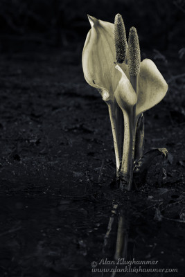
For this image, I have chosen a toned monotone… I converted the image to black and white, then added a subtle yellow to the flower and blue to the background. This helps separate the lily from the background. I also did some subtle “glazing{{2}}” to bring out more dimensionality.
I was originally drawn to the way the two flowers seem to almost be dancing together. They reminded me of a romantic couple.
The monotone treatment also gives the image a timeless feel.
[[1]]Black and white (B&W) is the more common term, but it is a bit misleading. It is very hard (and usually not desirable) to get pure black or pure white usually there is a colour tint. Also, very few pictures have just black or just white, usually they are a spread of mid tone “greys”. In fact it is rare that more than a small minority of tones are maximum dark or maximum light.[[1]]
[[2]]Glazing is a painting term I learned from an artist friend. In my Photoshop interpretation of it, I use a combination of burning, dodging, painting, and a few other tricks to enhance the sculptural qualities of the subject. In essence, lighter tones come forward while darker tones recede. By highlighting or darkening edges and specific areas, the photo gains a much more 3d feel than otherwise.[[2]]