Tone and Colour
In a previous lesson I looked at the arrangement of elements and composition of images. We touched on colours and tones. But now, let’s look at colour and tone in more detail.
Colours can have emotional connotations. Red tends to be dynamic, Blue tends to be more calming. A contrast of bright colours can add dynamism, whereas a monotone is more static. Also, some colours tend to come forward, like reds or yellows. Greens and blues tend to receed. We can use this information to control a viewer. We can even exploit this to give three dimensional look to a subject.
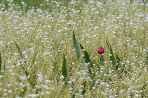
Tones refers to the lightness and darkness of specific areas. Black and white photography, of course, emphasizes this tonality, but you can have a light and dark green as well. As we have seen, our eyes tend to be drawn to light areas. Our eyes are also drawn to contrasting colours. A single red poppy in a field of green will draw the eye, regardless of it’s position in the image.
Once we have our image downloaded onto a computer, we can change these tones and even colours to emphasize emotional content of our image. Before we get into changing an image we need to learn about a histogram.
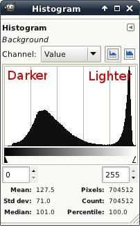
A histogram is a graph showing the number of pixels at any specific density.as you move right on the graph, the tones get lighter.

The image above is a screen capture of the GIMP histogram of the “Victoria in Snow” photo from the introduction. You will notice there are two areas with a lot of tone, but none of the tones are pressed up to the edges. Also there is a full spread of tones.


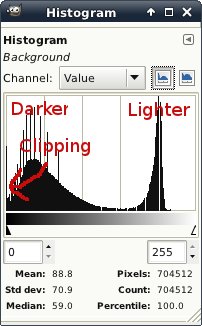
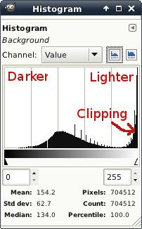
The two images above show the histograms of the same image after manipulating with the GIMP, showing under-exposure and over-exposure. You will notice that some of the pixels are pushed right against the edge. In the over-exposed image, there will be areas of pure white. If the image is printed, these areas will be the colour of the paper. This will produce a harsh, unnatural transition that can be very jarring. Under-exposure will make pure black areas devoid of any detail. Generally the pure black areas are less objectionalble than the pure white, but there can still be a harsh transition.
Most modern image programs have a levels, or even a curves adjustment this lets you change the relative brightness of various parts of the image. Setting an “S” curve will increase the mid tone contrast, giving the image more “punch.” conversely, a reverse “S” shaped curve will make an image calmer and quieter. Again, choose your controls according to what you want your image to say{{1}}.
Colour can be saturated or muted. An image can even be made more green, or blue, or whatever if that adds to the feel. There are a couple of cadveats to all these controls though. You can bring your image far from reality{{2}}. This may not be a bad thing in itself, but sometimes it can look jarring and “not quite right” if it doesn’t suite the subject. When you push these controls too far, you can also get “clipping”{{3}}.
[[1]]Controling contrast is, in my opinion, one of the strongest post processing tools we have. I almost always set curves before I do anything else.[[1]]
[[2]]For some definition of “reality” Often these controls can make things look more real than the unmanipulated, and technically truer to life rendition. Sometimes exagertating something way beyond “reality” can show your viewer more consisely what you wanted to say. In other words, do what is right for the photograph.[[2]]
[[3]]Clipping means that a group of pixels (or even a single pixel, but a single pixel is probably all but invisible to viewers) is outside the range of displayable colours. You can’t get whiter than white. In print terms, if the image is pure paper white, it can’t get any whiter. This can cause unnatural gradients and jaring transitions.[[3]]
